Evermaps is a SaaS company dedicated to optimizing its clients’ online presence. It provides a presence management platform and a Store Locator—a mapping solution integrated into websites that enables the geolocation of physical points of sale through store pages optimized for local SEO. This design system was created to streamline the process and reduce the delivery time of a Store Locator.
CONTEXT
A Design System is a centralized library of reusable UI components, design principles, and guidelines that ensure consistency, scalability, and efficiency across products. It streamlines collaboration between designers and developers, reducing redundancy and maintaining brand integrity.
CONCEPT
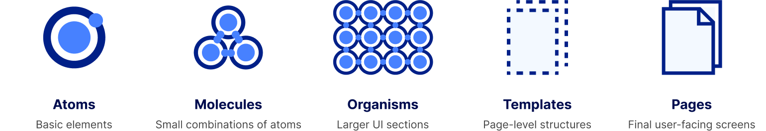
I have built this Design system following Brad Frost’s Atomic Design, a methodology that structures UI into five hierarchical levels:
The uniqueness of this design system lies in its purpose—it was created for a company that builds web pages designed to blend seamlessly into its clients’ websites. As a result, it differs from traditional design systems, which are typically used to maintain the same design consistency for a product.
ADAPTABILITY
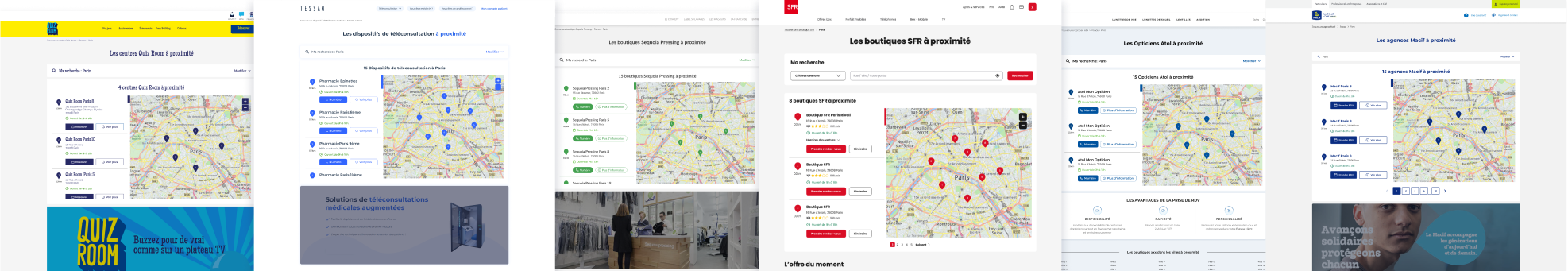
Here, the additional challenge is that our clients have highly diverse designs and brand guidelines. To address this, I developed a design system that simplifies the prototyping of Store Locator pages for a wide range of clients, with a strong emphasis on flexibility and adaptability. It contains a ‘neutral’ version of every feature Evermaps offers and serves as a template for creating client mockups. It functions almost like a CMS. To create a client mockup, you simply duplicate the design system template file and adapt it to the client’s branding, all while maintaining the consistency of Evermaps’ components across clients.
This way, what once required completely redesigning a store locator—block by block—for each new client can now be delivered in just a few clicks.
To achieve this, I built this template using a core set of components and made sure that every style—whether it was colors, fonts, sizes, border radii, or images—was easily adjustable. I also worked closely with the development team to ensure they could implement the same flexibility.
Here, I will break down how I achieved this by leveraging two key tools :
Variables and styles are key to an efficient design system. They allow you to define and store reusable values like colors, typography, and spacing. Updates to a single variable or style automatically refresh all components, ensuring consistency and saving time by reducing manual adjustments.
First, I used variables for colors, spacings, border radius and to toggle elements on templates, let’s take a look
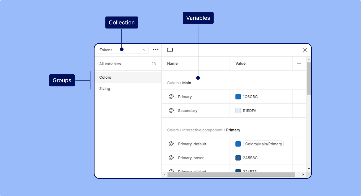
Here what variables look like in Figma :
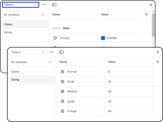
I created two collections of variables :
Tokens
First, I created a collection of tokens, containing base colors and sizings, used for spacing, padding, and border radius.
Design tokens are the building blocks of all UI elements. The same tokens are used in designs, tools, and code. They replace static values with self-explanatory names and help designers and developers « speak the same language,” reducing confusion during handoff from design to implementation.
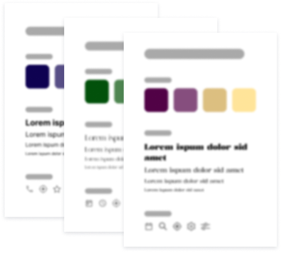
Here’s an example of how changing the primary and secondary main colors will impact the pages :
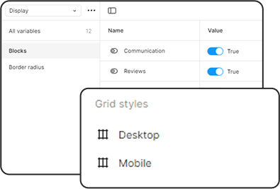
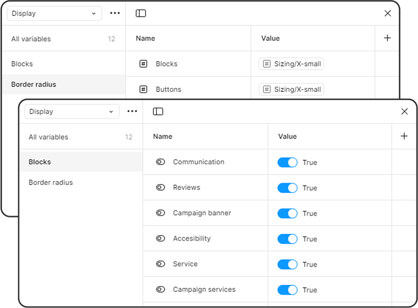
Display
Then, I created a collection called Display. It contains two groups:
the Border radius settings with assigned sizing tokens. They allow you to adjust the radius of ‘blocks—which refer to sections or widgets on the page—and buttons with a single click.
the ‘Blocks’ group, which uses boolean functions to determine which features are displayed on the client’s template. This way, the page adapts to the client’s choices with just a few toggles.
Here’s how these toggles work :
Variables & styles
02.
Styles
While Styles and Variables serve essentially the same purpose, Styles offer slightly less flexibility and control. However, they allow you to bundle multiple properties—such as font family, size, and weight—into a single reusable set.
Here are the two collections I created :
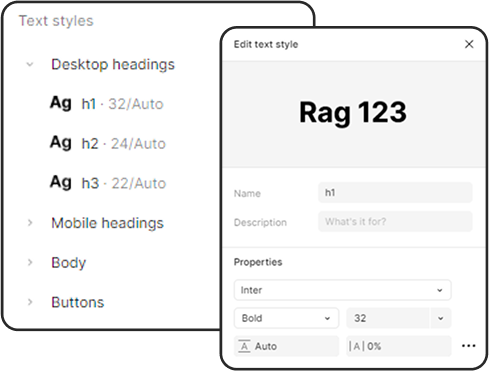
Typography
For typography since Figma doesn’t yet support managing size, weight, and font simultaneously within variables, Styles were the best solution. I created font groups for headings, body text, and buttons, containing only the essential font styles. For each client, simply modifying the font properties within these groups will automatically update all text in the template.
Grids
Grids structure content by aligning elements within a consistent layout, incorporating margins, spaces, and columns. These guidelines may vary between clients, especially concerning page margins. Adjusting the grid settings will update every template page accordingly
Components
01.
Structure
Components are reusable elements that keep designs consistent and efficient. Updating the main component automatically updates all instances. They support variants (different states) and properties (customizable settings), making them essential for scalable design systems.
I structured each component the same way:
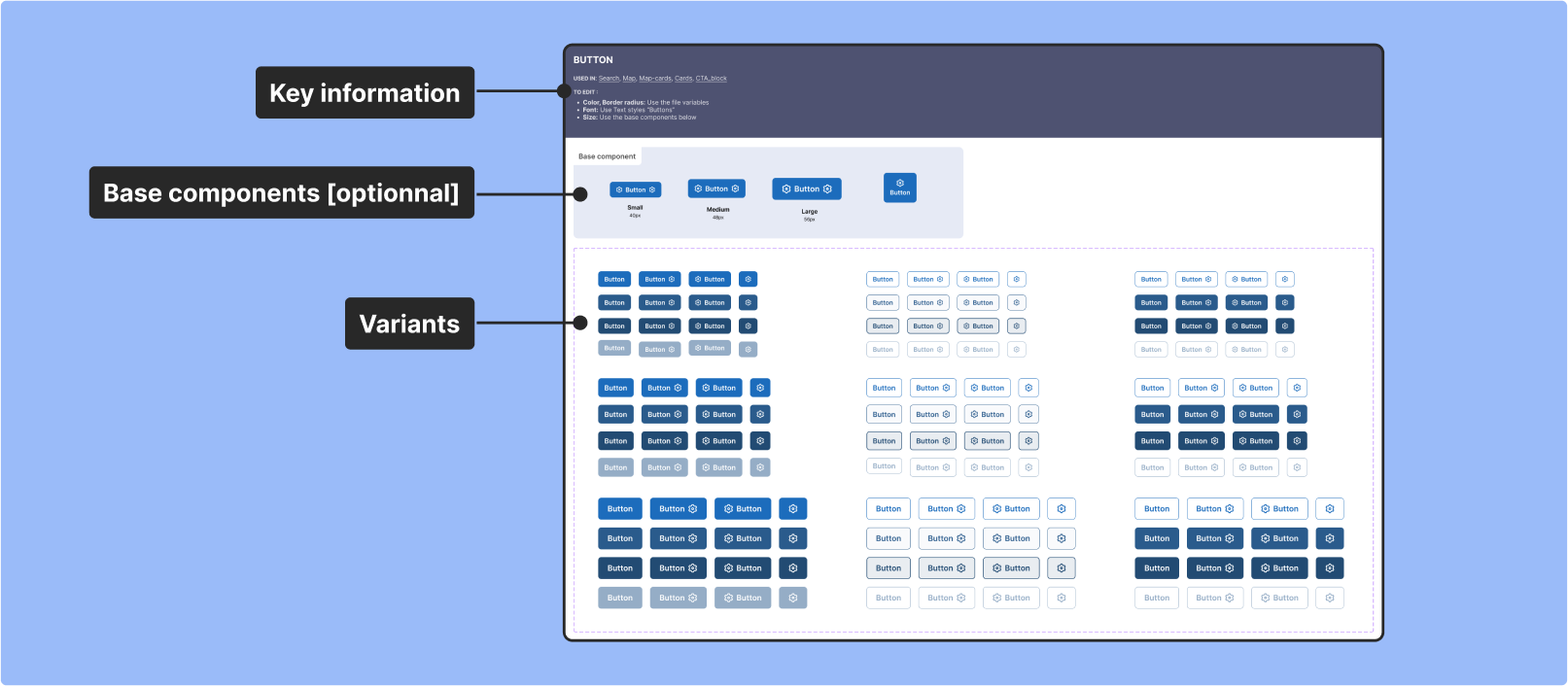
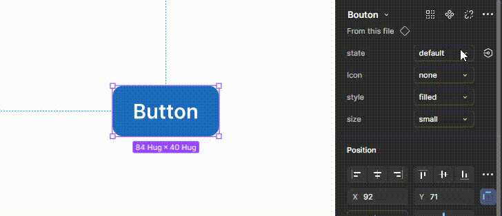
Let’s take a closer look with this example of the button component:
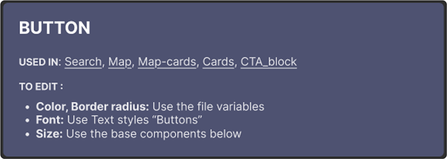
Key information
On each component, there are links to where it is used in higher-level components or pages, along with clues on how to edit them to ensure proper management of the design system when collaborating with other designers.
Base components [optionnal]
Some components—those with many variants and most likely to change depending on the client—are made with nested ‘base components.’ You only need to modify these, and all related components will undergo the same change.
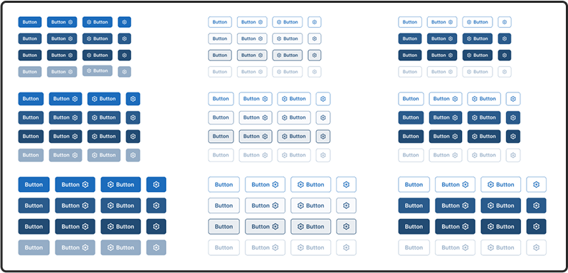
Variants
Variants are every possible versions of a single component. Each variant is affected by properties that allow you to switch the button component’s state, appearance, and behavior.
Here’s how it looks :
Components
02.
Pages
In Figma, components are reusable design elements—like buttons, icons, and forms—that ensure consistency across your project. Creating a master component allows for multiple instances that automatically update when the master changes, streamlining maintenance and promoting uniformity.
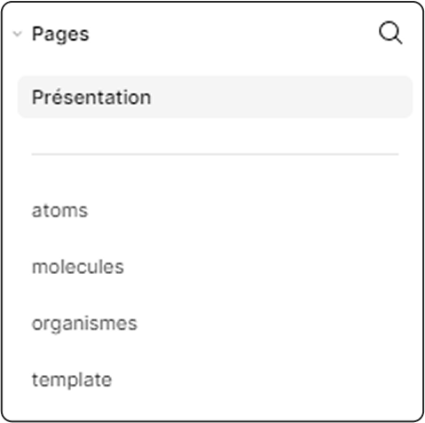
To keep the design system clear, I organized components across five pages following the Atomic Design methodology mentioned earlier.
Here’s an overview :
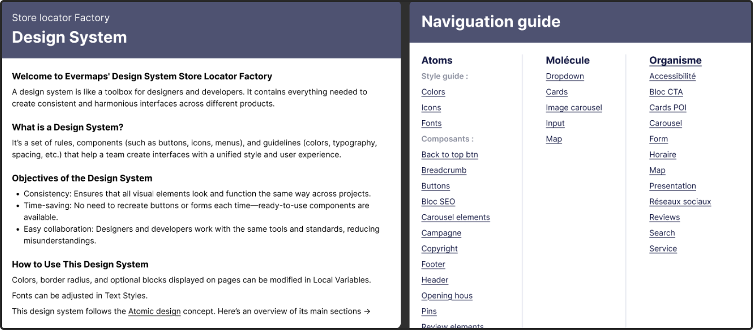
Presentation
On this page is key information about the design system, along with links to all its components for quick access.
Atoms
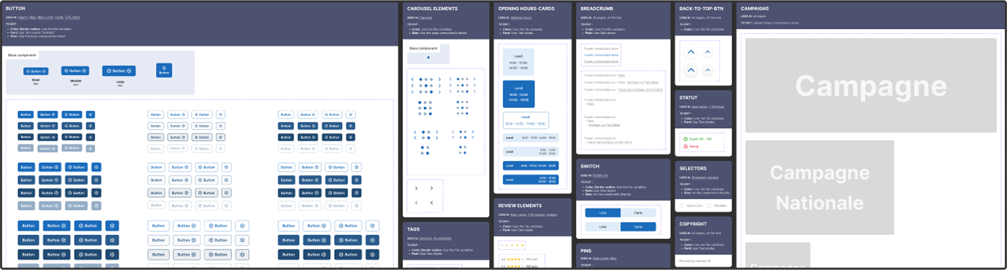
On this page are all the atoms components such as buttons, tags, selectors,…
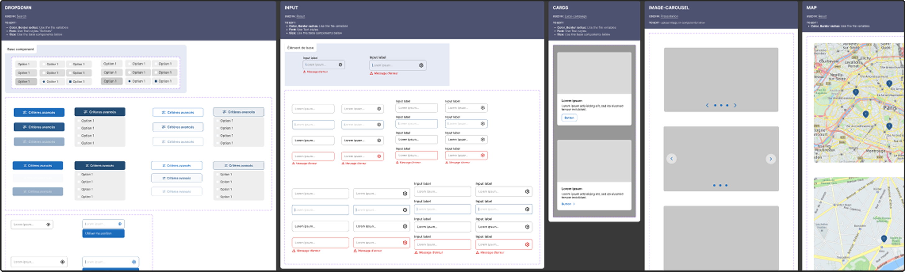
Molecules
On this page, you will find all molecule components, such as dropdowns, inputs, and cards, all constructed following the same approach described above. However these components are more complex and are composed of nested atoms components
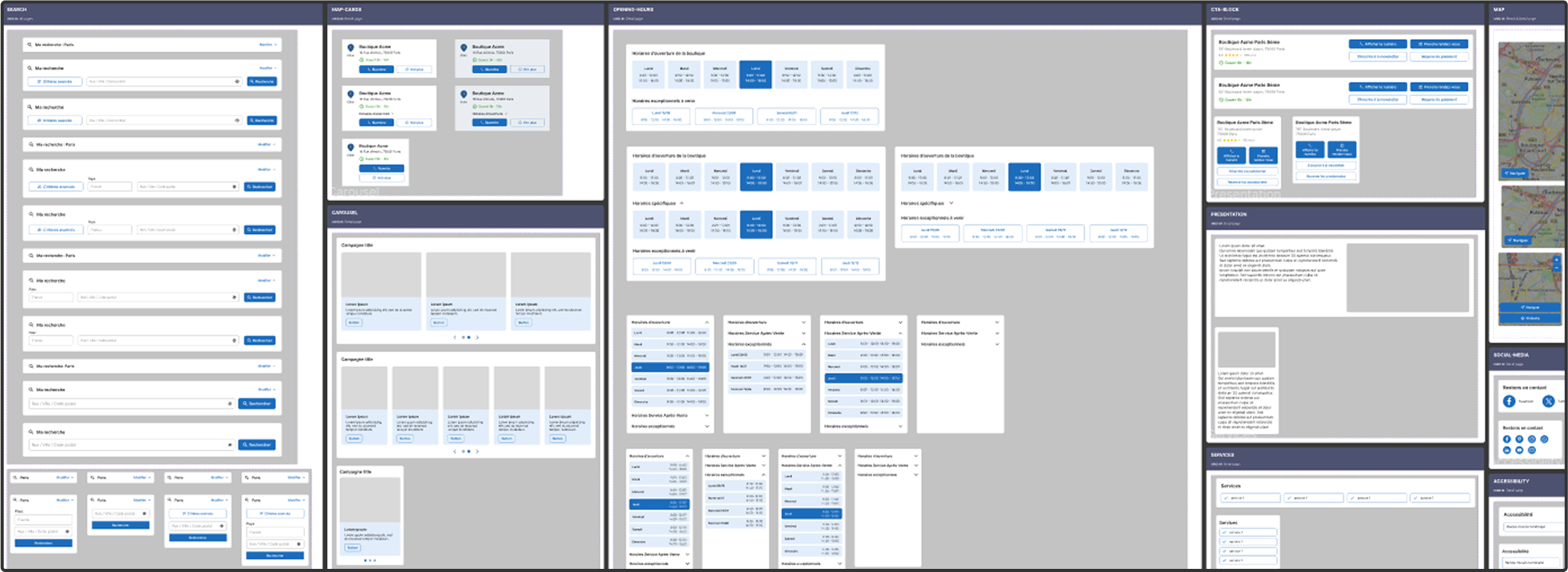
Organisms
This page contains all the organism components, which are made up of multiple molecules and/or atoms. They represent larger, functional sections, such as a navigation bar, a form, or a card carousel.
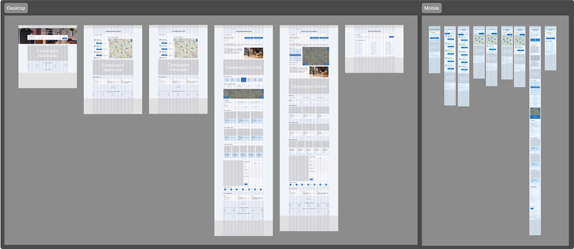
Templates
On this page you can find all the templates needed to build a client’s store locator. Templates are wireframe-like layouts that combine organisms, molecules, and atoms into structured compositions. They define the overall structure and content flow
To conclude
Evermaps’s design system has revolutionized its store locator development, cutting production time to just one-third of what it once was. By fostering seamless communication among clients, designers, and developers, this approach not only enhances productivity but also underscores the tangible benefits of a structured design strategy.
With the ability to create a store locator in just a few clicks, Evermaps can now concentrate on product innovation, confident that delivery timelines remain consistently on track.