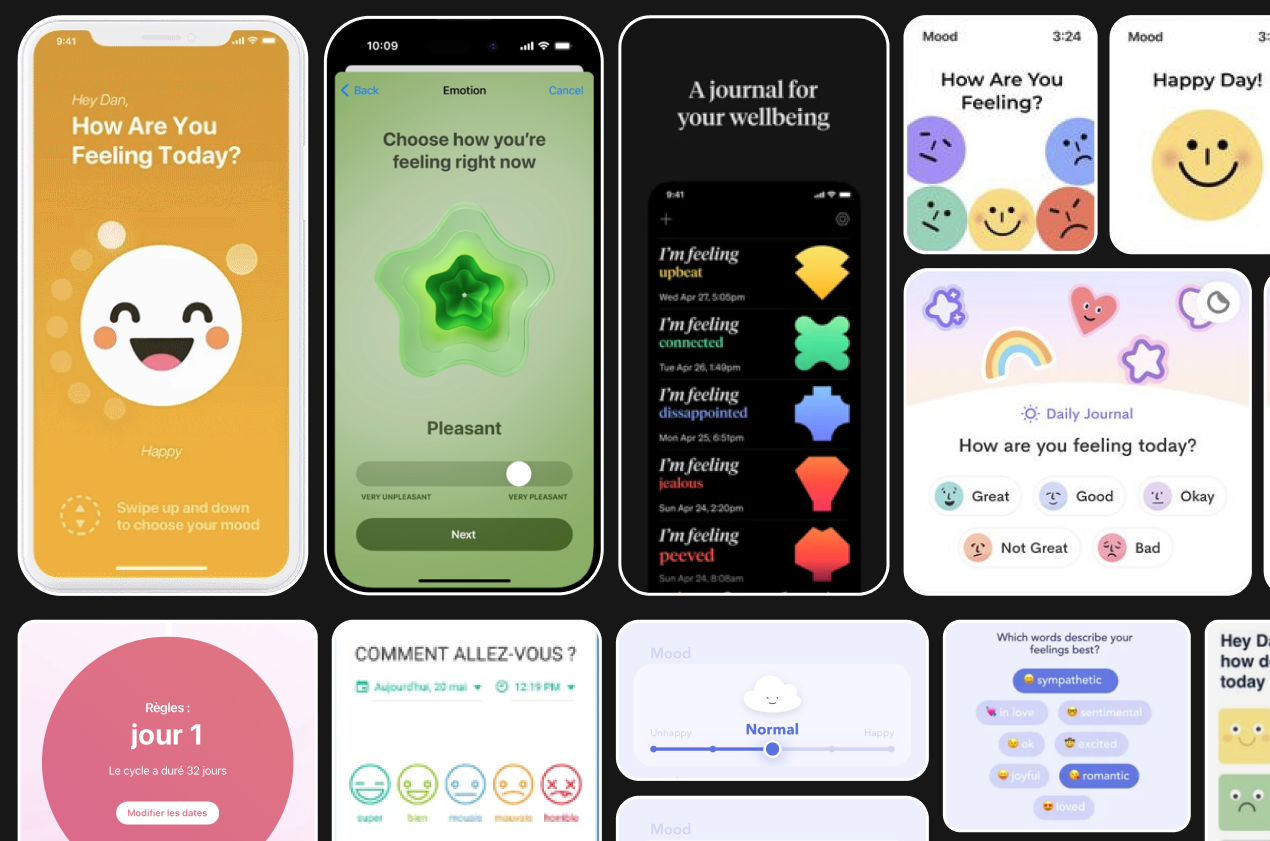
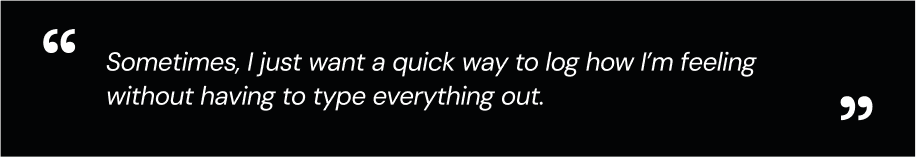
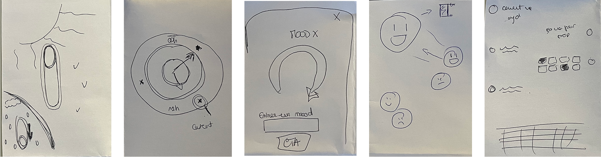
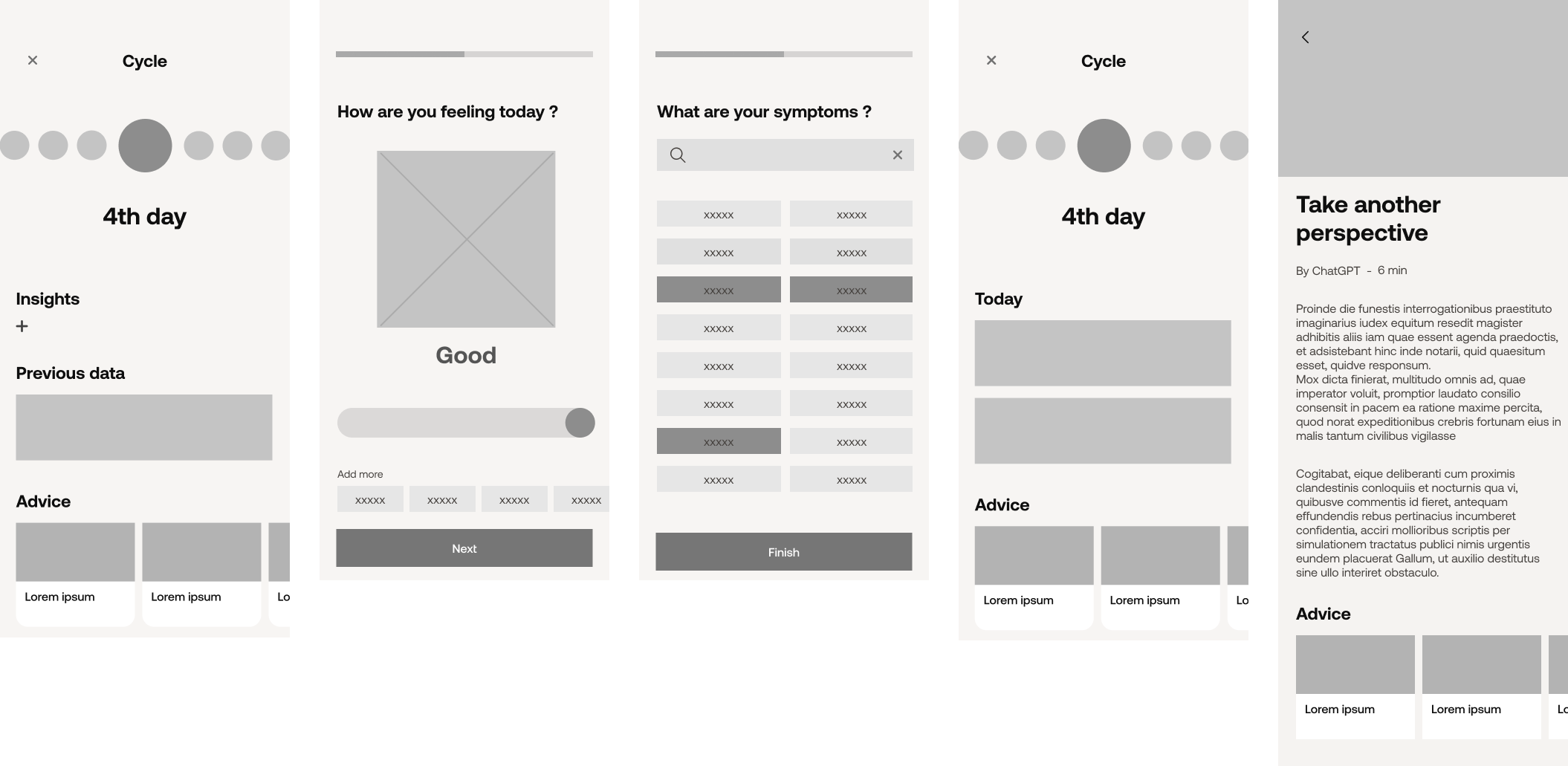
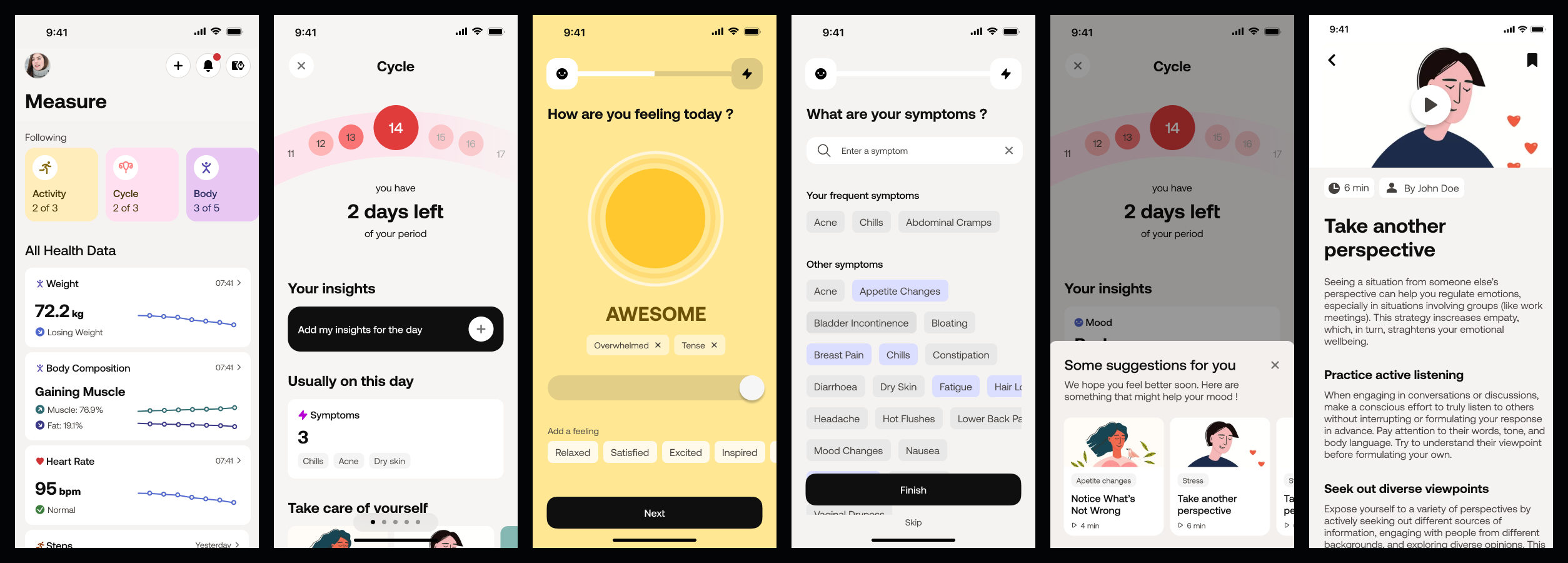
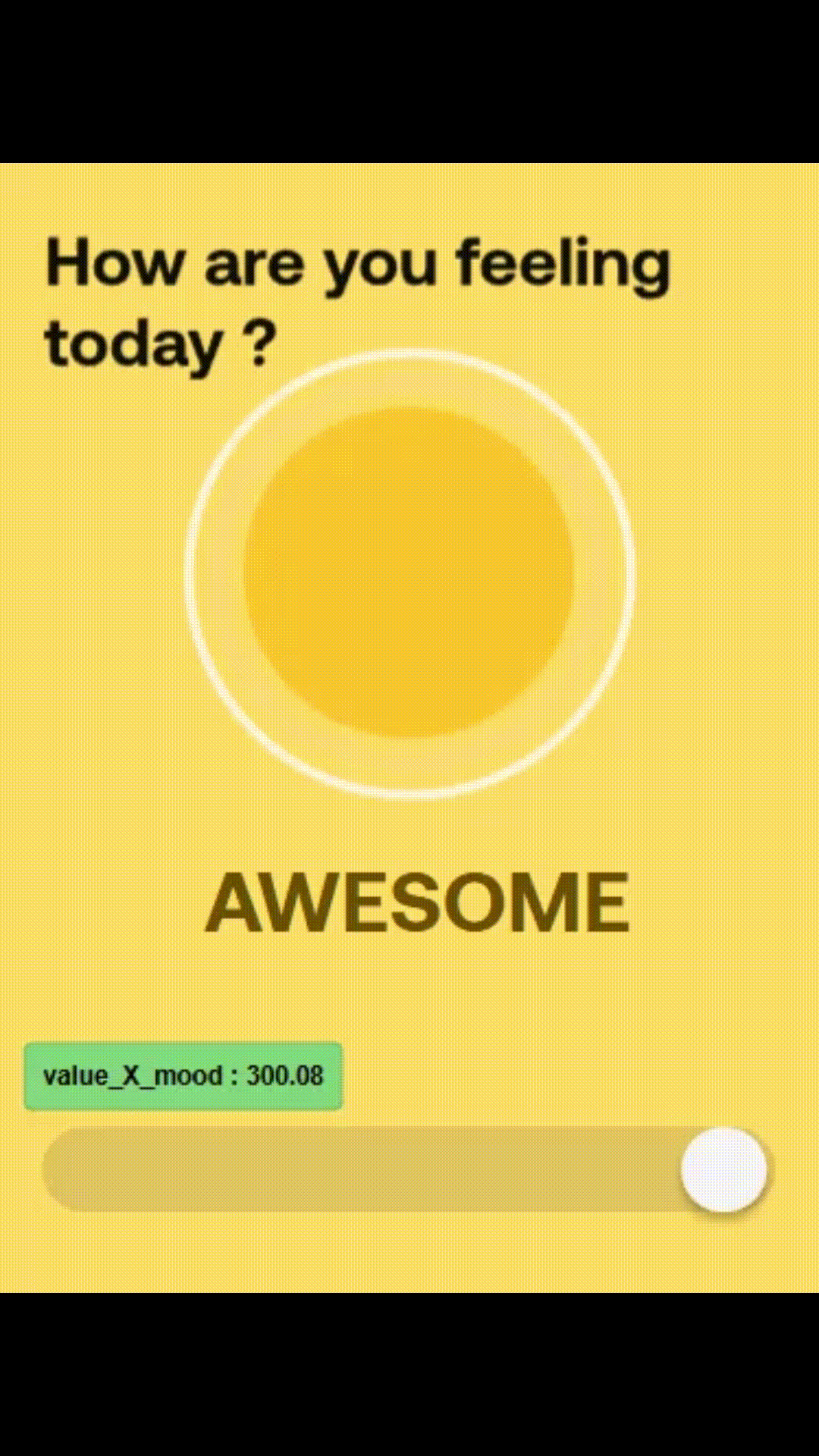
For instance, we decided against using smileys to indicate mood status, as they could unintentionally amplify a user’s negative emotions when they’re not feeling their best.
Instead, we opted for a cloud icon because it carries a neutral, calming quality that helps prevent emotional overload. Subtle, less defined visuals can make users feel more at ease while still effectively conveying their mood status.